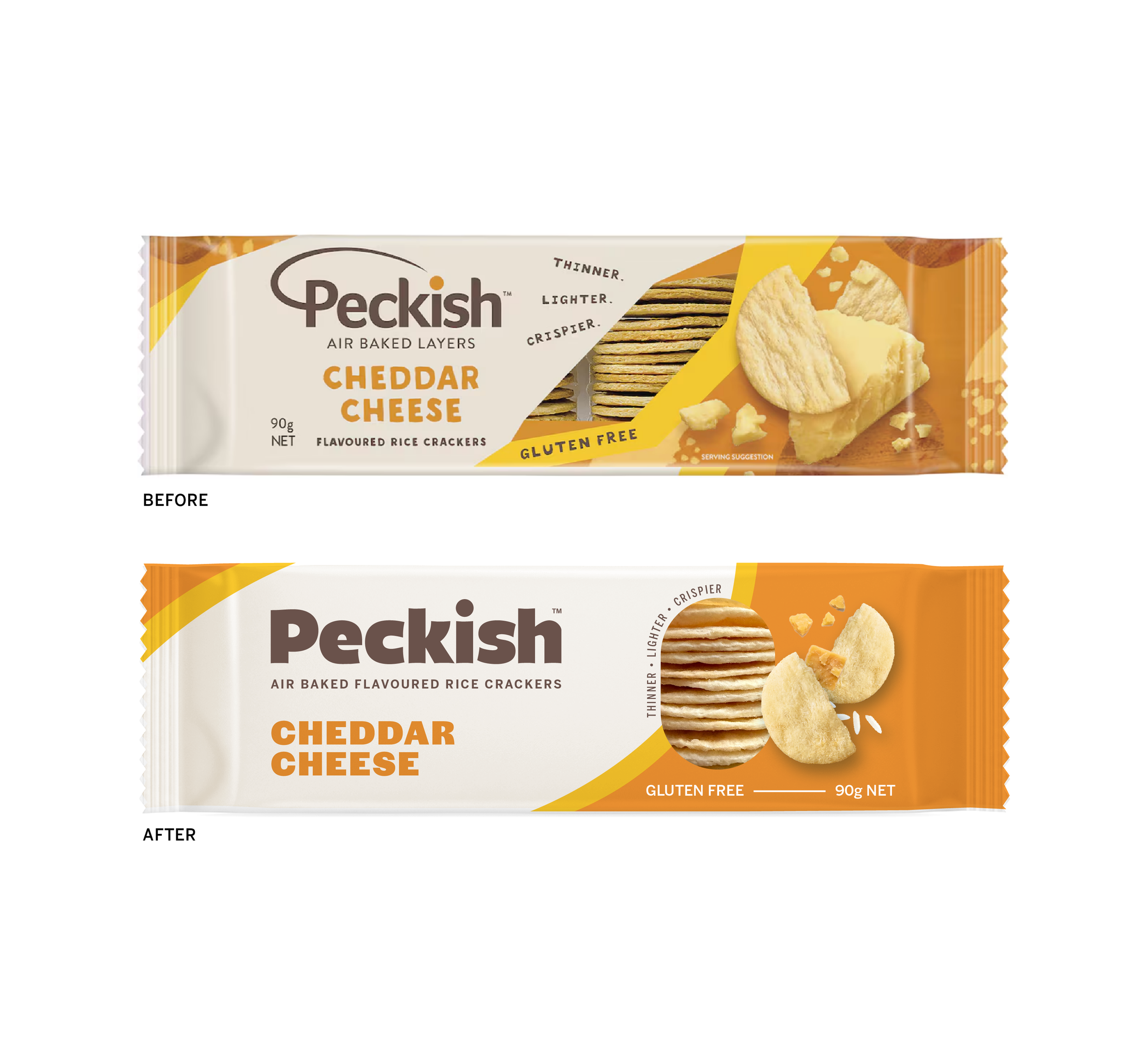
A Redesign Challenge: Rethinking Peckish
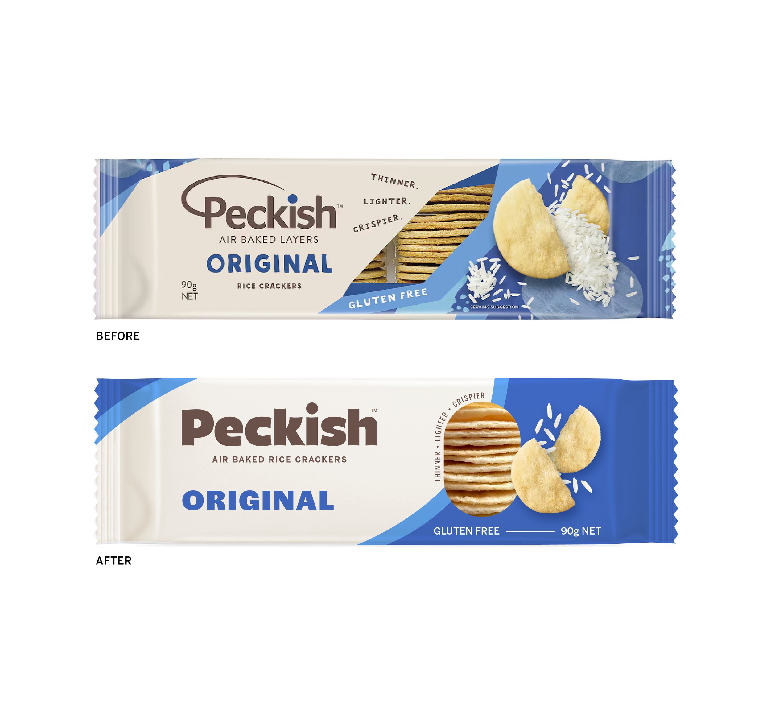
Peckish has been one of my favourite snacks for years, and I have always wondered how I would redesign the packaging if I had the chance.
The goal was not to reinvent the brand. Peckish already has a strong and recognisable identity, so I wanted to keep what makes it feel like Peckish while giving the overall system more structure and stronger shelf presence.
I focused on tightening the relationship between the logo, product name, flavour, imagery and supporting information. Small changes to scale, spacing, hierarchy and alignment helped create a system that feels more intentional and cohesive across the range.
I also wanted the redesign to remain subtle to the untrained eye. Nothing should feel dramatically different at first glance, but the overall pack should feel cleaner, sharper and more considered.
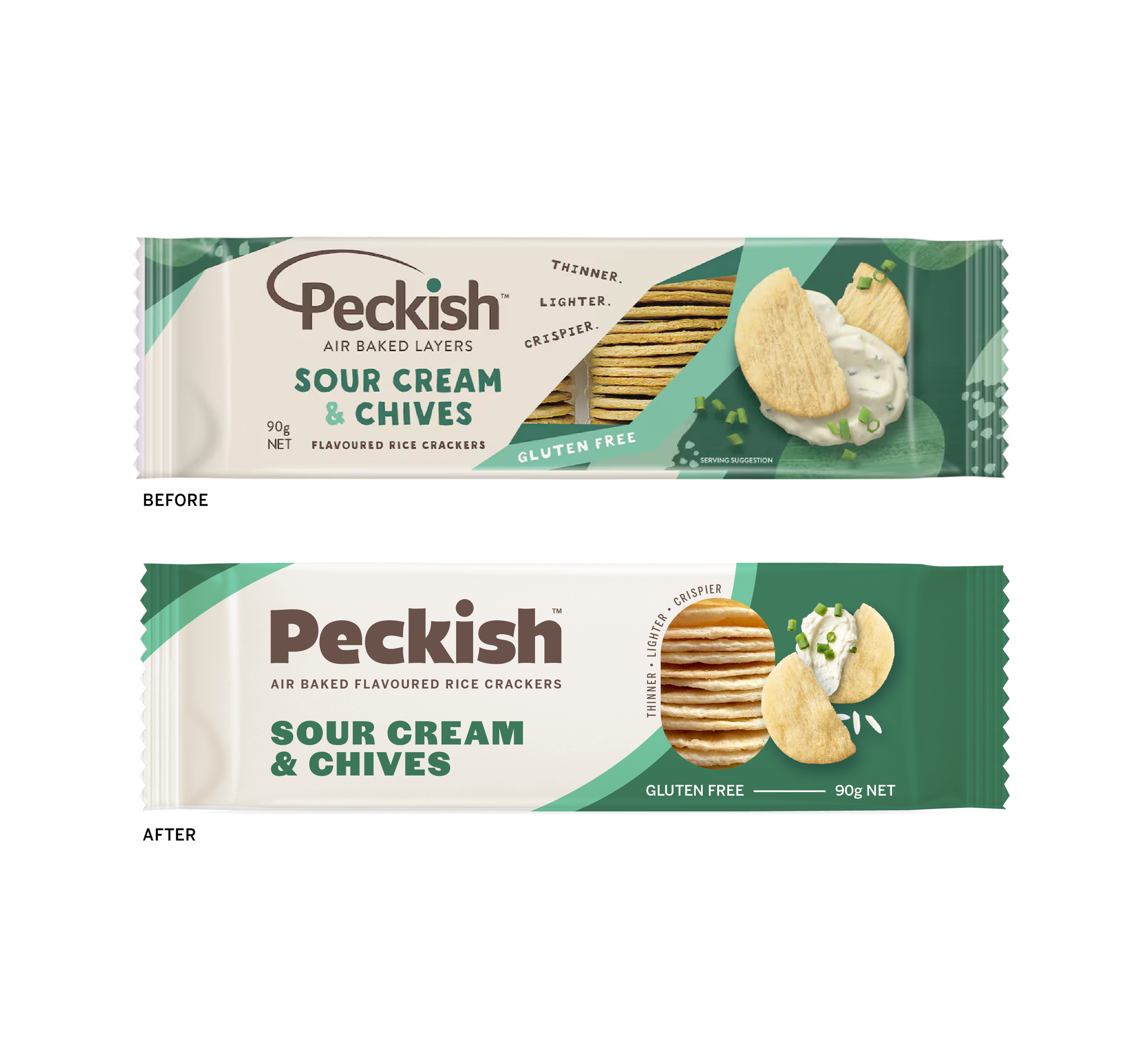
It was really an exercise in asking how much you can improve a familiar brand without taking away the things people already recognise and love about it. Would you pick up the redesign on shelf?